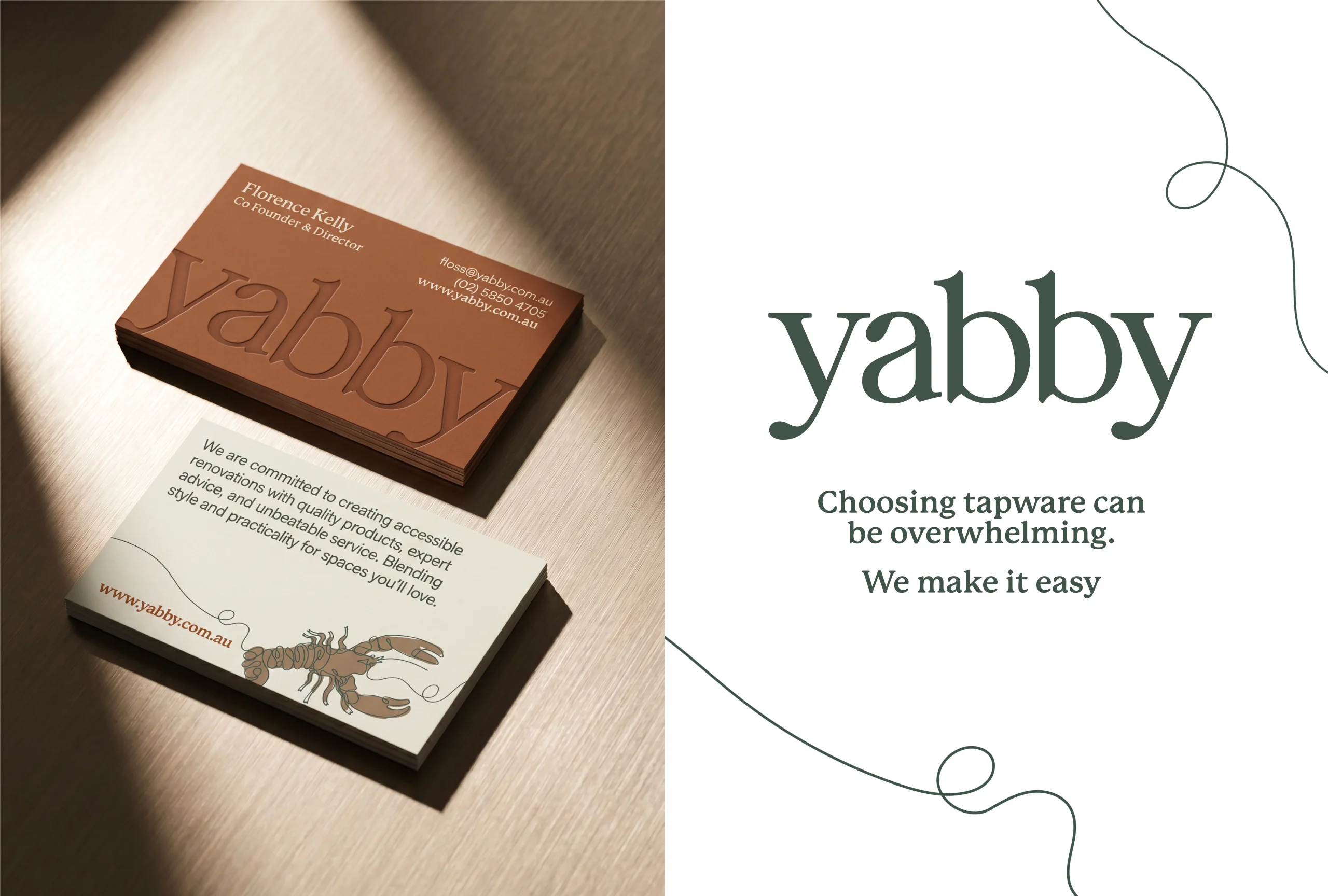
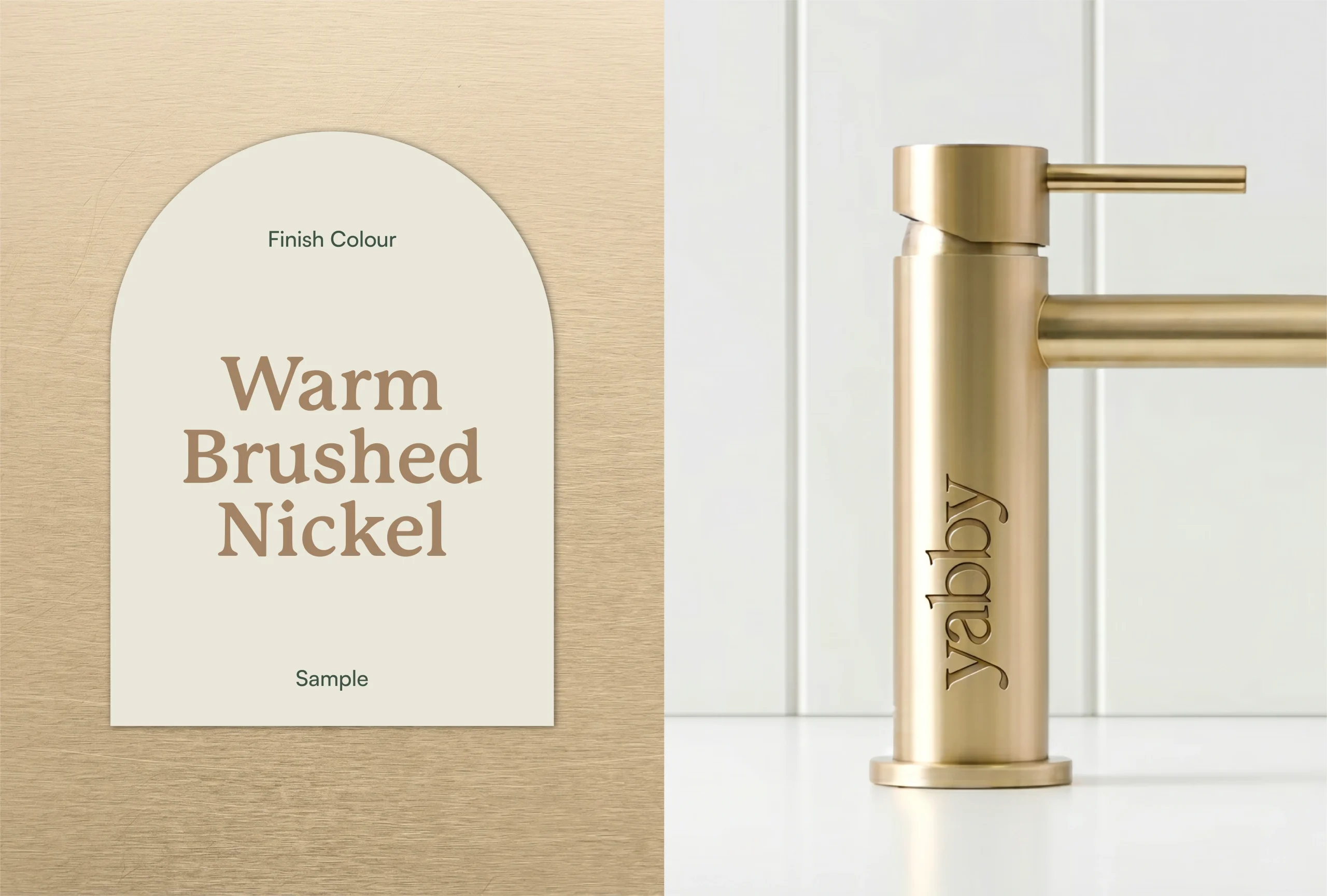
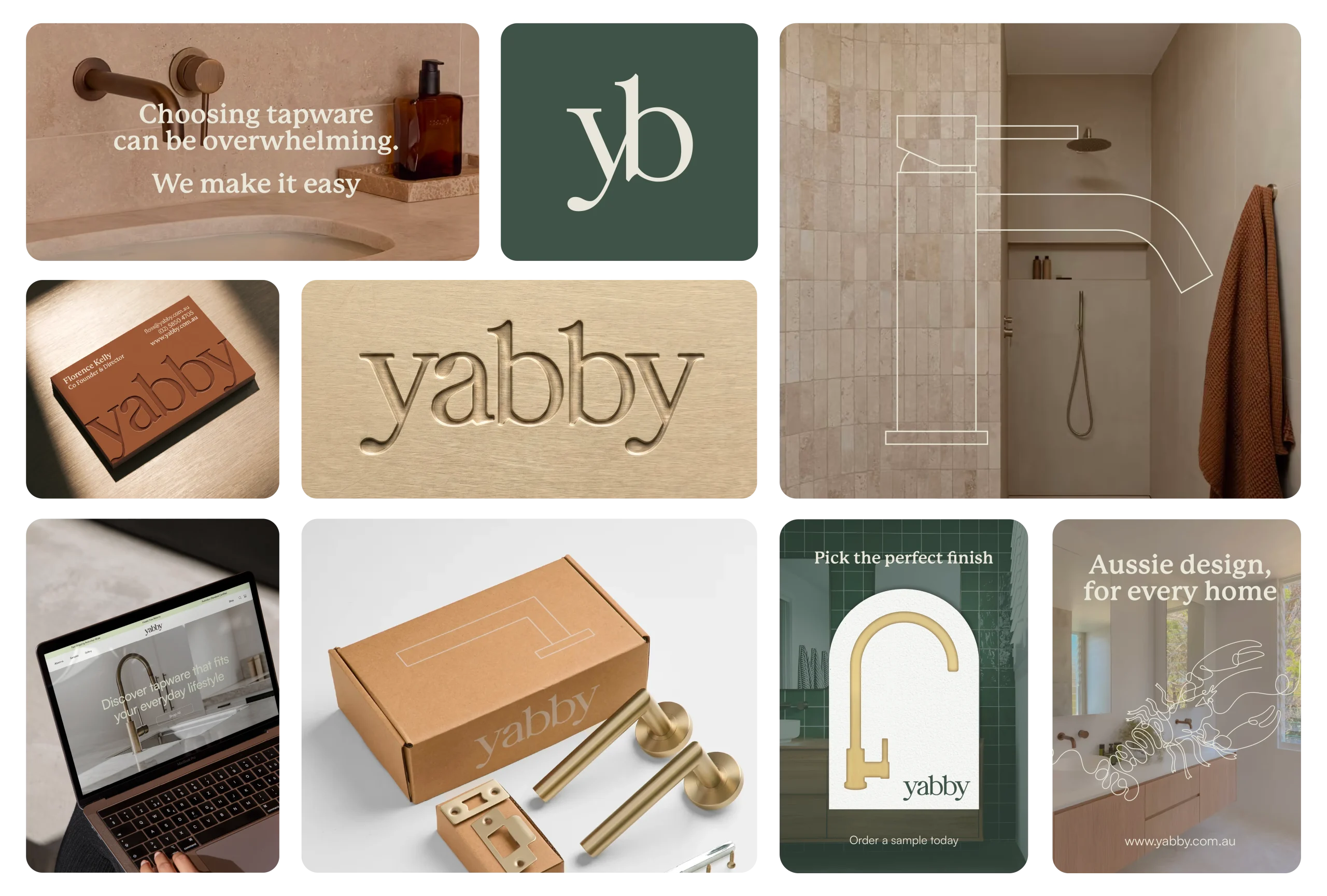
Yabby is an online tapware brand based in Australia, created for the renovator who wants unique, quality design at an achievable price. The business had real strengths—distinctive products, loyal customers, glowing reviews—but a visual identity that hadn’t yet grown into its ambition. The gap to close was a visual one: give a well-liked product a coherent, confident look that could carry across every touchpoint. We built the system to do exactly that. A refined lowercase wordmark, designed to sit alongside sister brand TileCloud. A continuous-line yabby illustration, faced east to signal a forward-thinking business, flexible enough to live across any layout. A grounded, authentically Australian palette of Gumtree, Outback, Redback, Brass and Eucalyptus, with subtle shell-like textures applied sparingly, rounded image framing, and a warmer, rounded heading font that softened the premium feel into something more welcoming. Every decision was made with intention and built to scale. Today the identity gives Yabby a warm, confident presence — accessible Aussie design that shows up consistently across web, packaging, social and beyond.