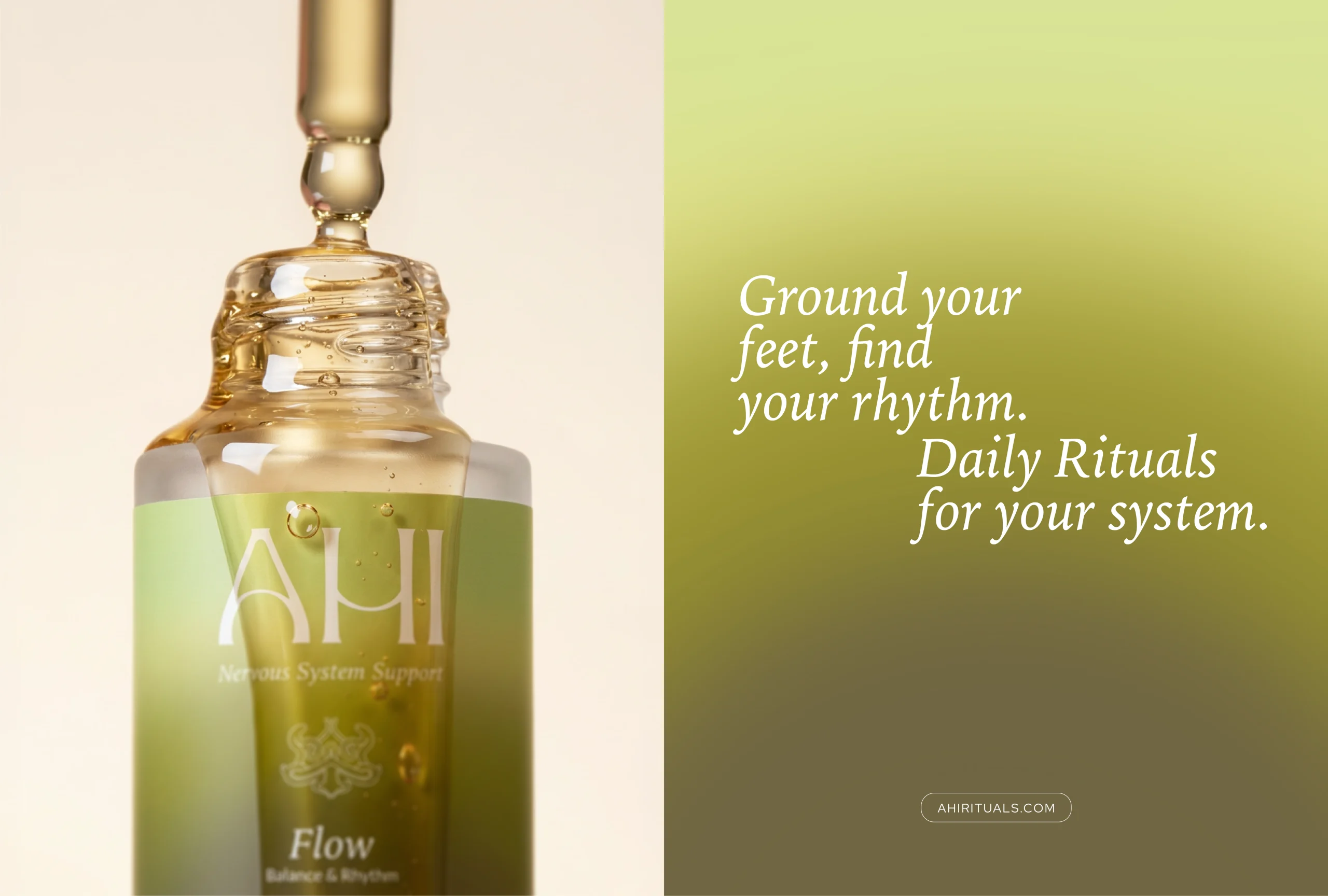
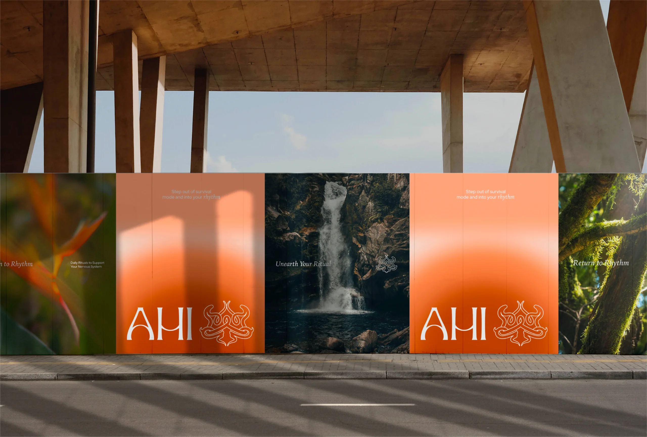
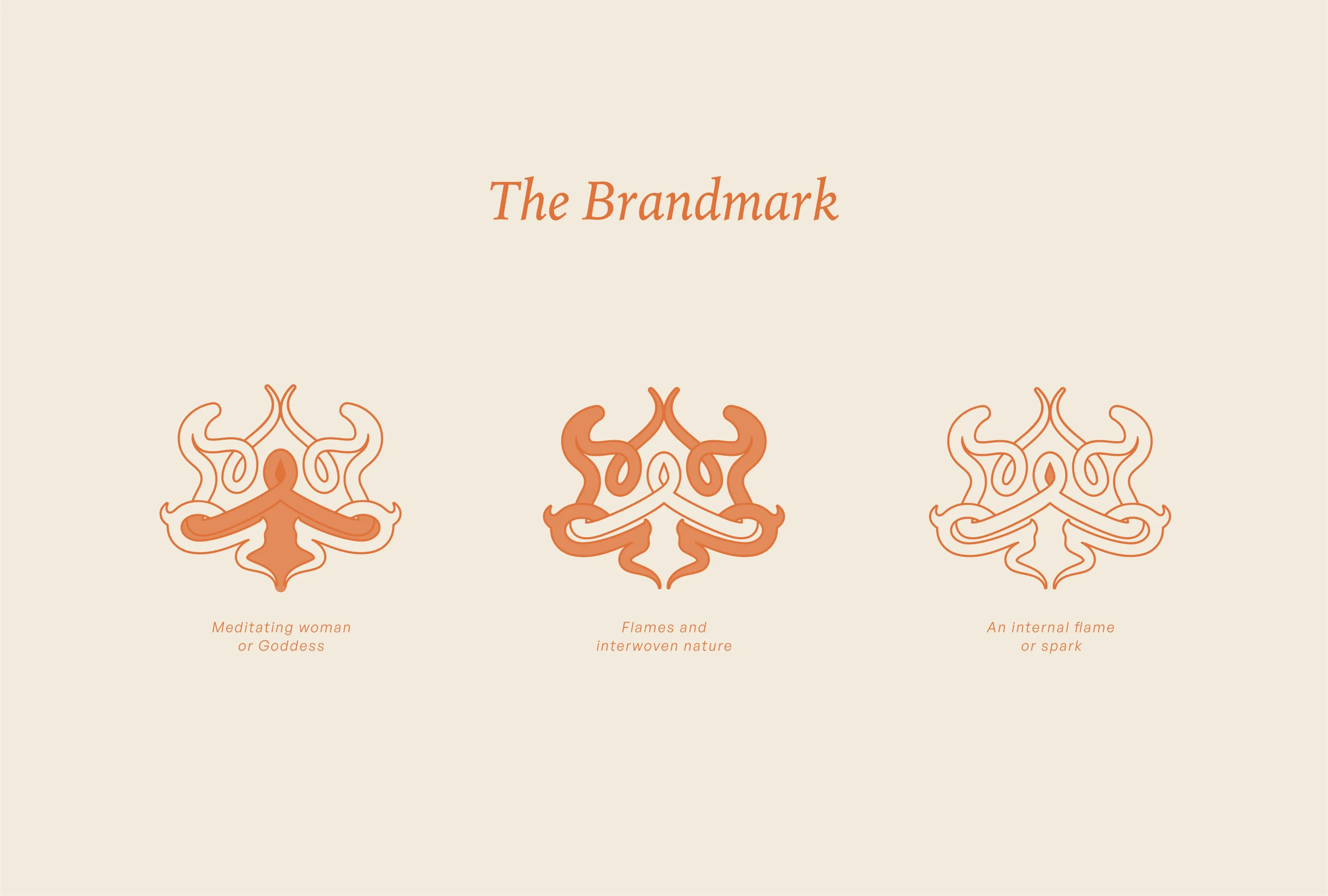
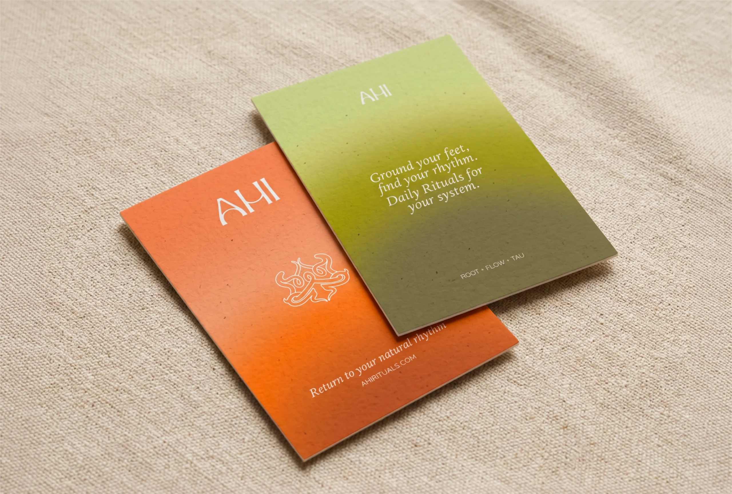
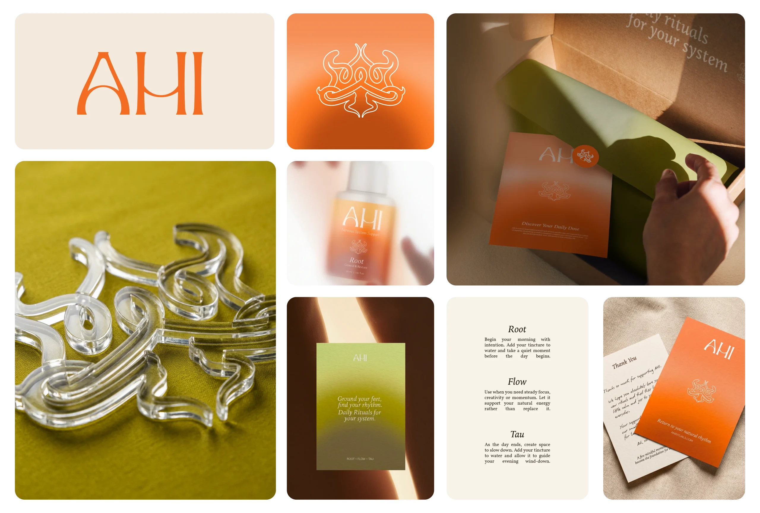
AHI Rituals is a ritual-based wellness brand founded in New Zealand, created for women who are high-functioning but internally overwhelmed; designed to bring them out of survival mode and back into steady, daily rhythm. Founder Talia came to us at the beginning; no existing identity, just a deeply personal vision rooted in her Māori heritage and a clear understanding of what wellness was getting wrong. The gap to close was significant: a brand that needed to carry genuine ancestral meaning while positioning credibly for global retail shelves like Sephora and Mecca. We built an identity anchored in the name itself. AHI means fire in te reo Māori—specifically the fire drawn from wood in the story of Mahuika. A Māori-inspired mark sits above the wordmark, grounding the visual system in that mythology before a single product is picked up. The palette moves from earthy, coastal warmth to considered accent tones that perform at retail scale. Typography is quiet and deliberate throughout —nothing decorative, everything purposeful. AHI Rituals now presents as what it has always been: a brand with something real behind it. Minimal. Intentional. Premium without ever needing to be loud.